
All Components
All Components
Find a component, check its preview, and see where it is used.
Use All Components to find a reusable part of your UI, such as a button, card, form, or navigation item. It is the best place to start when you know what you want to inspect but not where it lives.
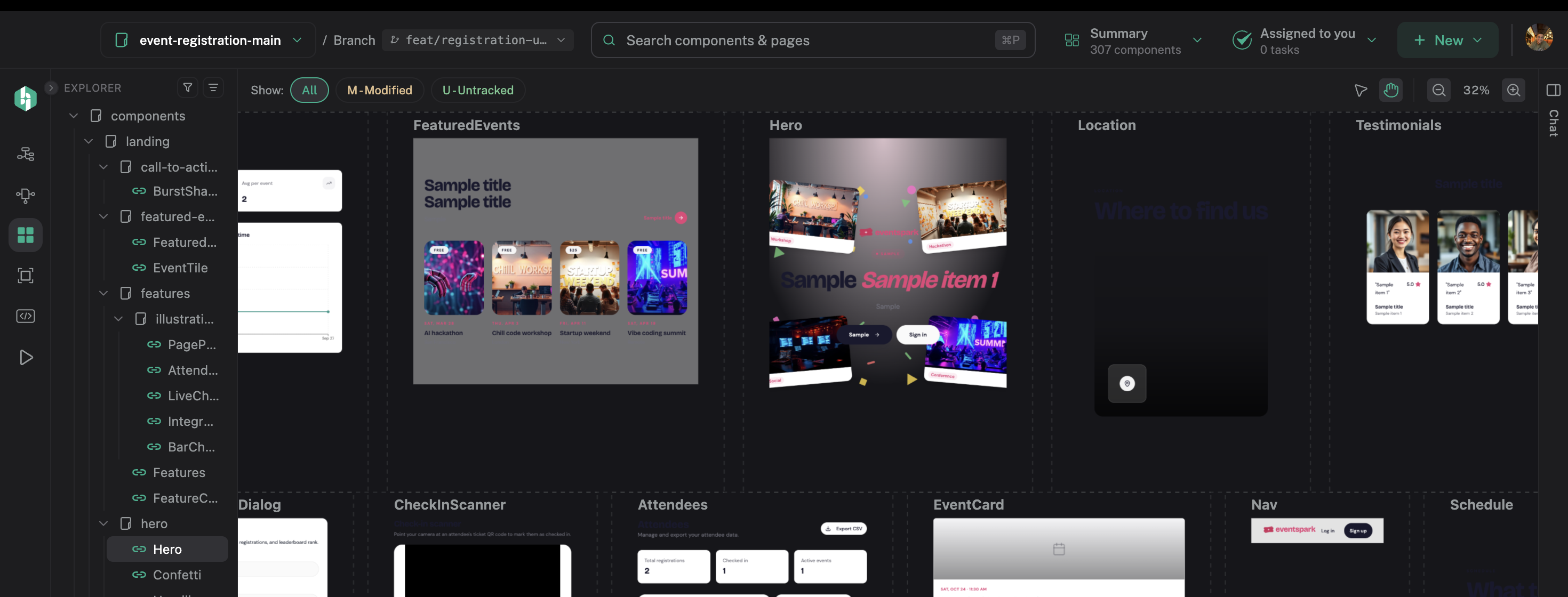
All Components keeps the project inventory and rendered UI visible together.
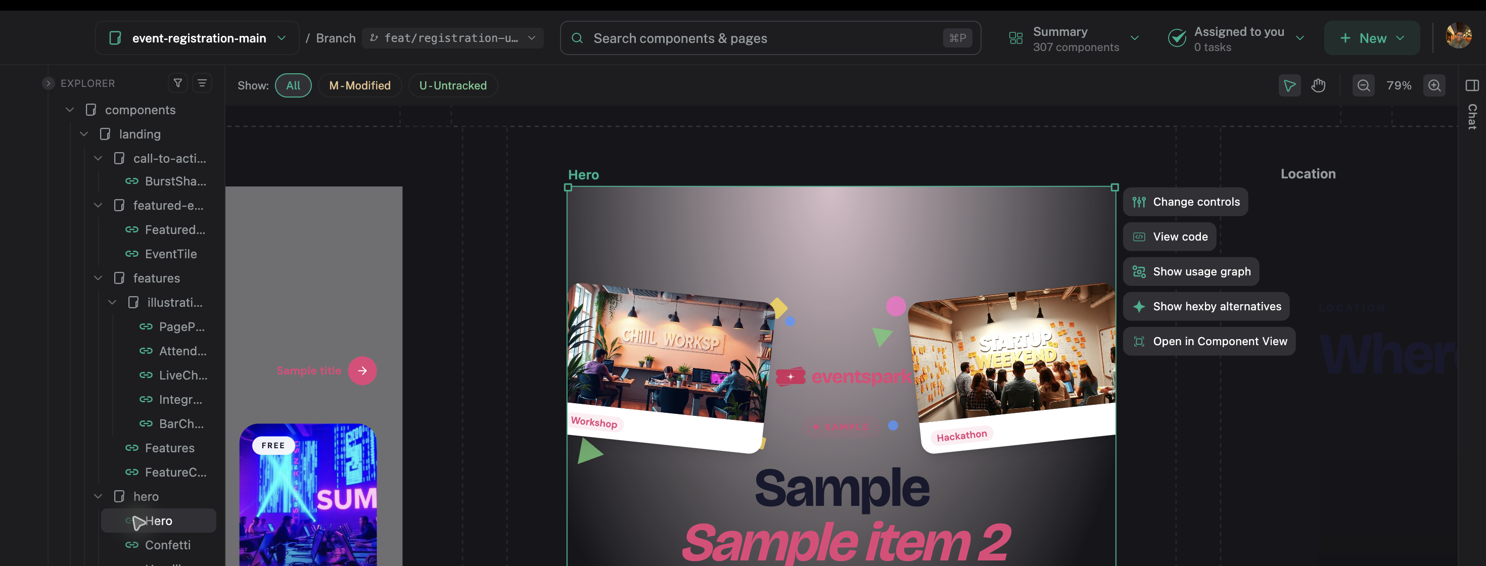
Select a rendered component to prompt, compare alternatives, or open its isolated view.
Find a component
- Open All Components.
- Search by component, feature, page, or source file.
- Use the filters to narrow the results.
- Select the result that matches the UI you want to inspect.
If you are not sure of the name, search for one short, distinctive word.
Check the preview
Compare the preview with the part of the product you have in mind. Check its content, size, state, and surrounding UI before deciding it is the right match. Zoom out to scan more components at once, then focus the selected component when you need a closer look.
A preview can be ready, loading, partial, or blocked. Read the message on a blocked preview before taking action.
Open the details
Single Component View shows the selected component’s:
- Preview states and example data
- Pages and parent components that use it
- Related components and dependencies
- Source file and location
From there, you can open the usage graph, view the source, see the component in context, explore alternatives, or ask your connected assistant for help.
Choose the next view
- Pages shows the component in a screen.
- Component Map shows relationships across the project.
- Code View shows the source behind the UI.
- Preview App shows the full running app.
Your selection stays connected as you move between views.
If you cannot find it
Check that analysis is complete and that no filter is hiding the result. If you are still stuck, search the source in Code View or review First Analysis.
Next step
Open Single Component View to inspect the component before you make a change.