
Design Mode
Edit your app UI visually, with changes written back to your project.
Design mode lets you edit your app with familiar Figma-like controls. Select a heading and enter its font size, or select a card and adjust its spacing. You get precise control and can see each change without writing a prompt for every small edit.
Hexby saves supported edits to your project’s code. Use your AI Agent when a change needs more than these controls.
Start designing
Start with the page or component you want to edit.
- Open a component, All Components, Pages, or Preview App.
- On a canvas, select the card you want to edit. In Preview App, wait for the app to load.
- Click Design in the toolbar.
- Click an element in the preview, or choose it in Layers.
Select a button, image, or heading in Layers, then edit it in Properties. To change a group’s layout or spacing, select its container: the box holding the items.
You can also edit directly in the preview:
- Change text: double-click it and type. Press Enter to apply or Esc to cancel.
- Reorder elements: drag an element to a new place in the layout.
- Move elements: drag an element with Absolute positioning or move it with arrow keys. Other elements follow their container’s layout.
Check the preview first
Wait for the preview to load before editing. If it is empty or blocked, see Troubleshooting for help.
Try your first edit
Change a heading’s font size:
- With Design mode on, select a heading in the preview or in Layers.
- In Properties, find Font size and enter a new value, such as 24.
- Press Enter or click outside the field to apply it.
- To undo the change, click Undo in Layers or press Cmd+Z. Use Redo to restore it.
- Click the × beside Design in the toolbar to leave Design mode and check the updated preview.
If Hexby says the edit is not saved, see Check whether your edit was saved.
Shared components
A change can affect other copies of the same component. Use Show usage graph in Component View to see where it is used.
What you can edit
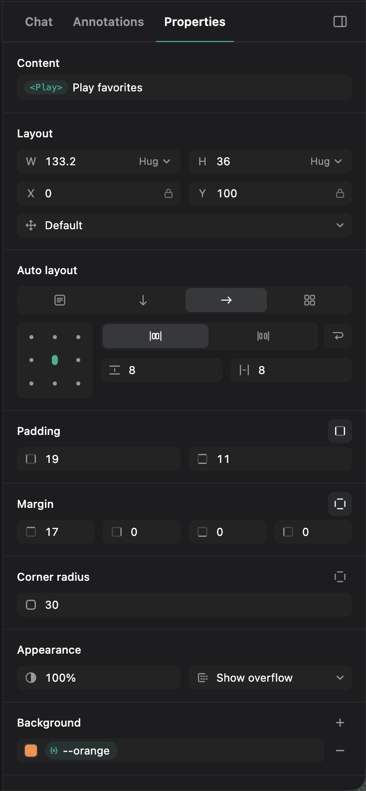
Select an element to see its controls in Properties. Some values are read-only, which means you can see them but cannot change them here.
| Area | Available edits |
|---|---|
| Text content | Inline text, content field, supported static list values. |
| Typography | Font family, size, weight, style, line height, letter spacing, alignment, decoration, case. |
| Size and spacing | Width, height, Fixed/Hug/Fill sizing, padding, margin, gaps. |
| Auto layout | Block, Row, Column, Grid; alignment, packed/space-between spacing, wrapping. |
| Appearance | Corner radius, opacity, solid/gradient/image fills, strokes, shadows, layer/background blur. |
| Position | Position mode, absolute-position anchors. |
| Overflow | Visible, clipped, scrollable. |
| Design values | Existing theme tokens and CSS variables for color, spacing, radius, and size. |
Fixed sets a size, Hug fits the content, and Fill uses the available space. Anchors keep an absolutely positioned element attached to an edge of its container, such as the top or right edge.
Choose Design mode or an AI Agent
| What you want to do | Where to start |
|---|---|
| Adjust a heading, color, padding, or corner radius | Design mode |
| Reorder existing elements or adjust a container’s alignment | Design mode |
| Add, copy, or remove an element, section, or screen | AI Agent |
| Add form checks, page links, data loading, or other behavior | AI Agent |
| Explore a broader redesign or apply a change across several screens | AI Agent |
| Change text from app data, such as a user’s name | AI Agent |
| Move an element to another component, such as a button from a card to the header | AI Agent |
Use both as you work. For example, ask your AI Agent to build a form, then adjust its spacing in Design mode. See AI Assistant to connect an agent.
Design mode uses fonts and design values already in your app. Choose saved values from the variable picker, or enter an image link for a background fill. Ask your AI Agent to add fonts, create design values, replace other images, or set grid rows and columns.
If a control is locked, follow the message shown. You can also select the container around the element or ask your agent for help.
Check whether your edit was saved
Supported edits save to your project files when you apply a value or finish a drag. Saving does not share your work or create a Git commit.
Check the message beside the field or on the canvas to see whether an edit needs your help:
| What you see | What to do |
|---|---|
| Your change appears with no warning | The change is saved. Check that it looks right. |
| Not saved | You can see the change, but it is not saved to your project. Choose Apply with agent to ask your agent to make the change, or Revert to cancel it. |
| Saved but not showing | The code changed, but another style may be overriding it. Choose Apply with agent for help. Dismiss hides the message; it does not undo the edit. |
To send several changes together, choose Apply all with agent in Properties. Check the list before sending.
Wait for your agent to finish, then check its code changes and the updated preview. To connect an agent, see AI Assistant.
The preview may change back
After you send edits to your agent, the preview may change back until the agent finishes making the changes.
Check your changes
Click the × beside Design in the toolbar to leave Design mode. Then:
- Check the updated preview. Some previews refresh only after you leave Design mode.
- Open Preview App and try the buttons, links, and forms you changed.
- Use Desktop, Tablet, and Mobile in the preview toolbar to check different sizes. An edit can affect other sizes, depending on how your app is styled.
- Review the changed files in your code editor’s Git changes view.
If you want a different layout on mobile, tell your AI Agent what you need. For example:
Keep the cards in one column on mobile and three columns on desktop.
Next step
Use Visual Review to compare your changes and share them with your team.